
![SARAH STOKES LOGO [BLK].png](https://static.wixstatic.com/media/2781d1_6a3d829b05b14b068fa55ca473f34451~mv2.png/v1/fill/w_167,h_139,al_c,q_85,usm_0.66_1.00_0.01,enc_avif,quality_auto/SARAH%20STOKES%20LOGO%20%5BBLK%5D.png)

Help with seeing colour...by Sarah Stokes
- Sarah Stokes

- May 6, 2022
- 2 min read
The Challenge
Creating the colours for a painting is one thing, but seeing the colours in the first place is an important starting point when you’re painting. In this photograph of a peacock, there’s a myriad colours and it can be difficult to see them for their true colour. I’m not talking about the really obvious blues and greens, but rather the more muted, neutral shades that are really hard to describe.

Photo reference Ian Gray
In the above photograph, there are a few colours that may be problematic because we can’t readily name them and we tend to generalise them as creams, beiges or greys for instance. But what we need to establish is what value and hue an individual colour really is. For instance is it a “light peach”, “dark pinkish”, “mid greenish” “dark blue/grey” or so on? Sometimes it is even easier to establish what it isn’t and go from there.

One of the problems that we have with identifying colour is due to a phenomenon called simultaneous contrast. The theory is that one colour can change how we perceive the tone and hue of another when the two are placed side by side. The actual colours themselves don't change, but we see them as altered.
The rectangles above show an example of one shade of green laid over different colours. Look how much darker it appears when it’s over the yellow, compared to the grey.
Solution One
There are a number of digital apps on the market that can help you overcome this such as the Colorslup app. In the photograph below you can see how it has highlighted a problematic area within the peacock photograph, that of the lighter wings. Now we are able to see more clearly that it is a light apricot shade.

Colorslurp in action!
Solution Two
One of the other ways to overcome this is to surround the problematic section of colour with white. In my class, several of my students used to use a home made viewing aperture, when they were starting out, to help them ascertain the hue and tone of a colour, until they eventually no longer needed it. The images below show that if you place a piece of white paper with a viewing hole, over the colour in question, it’s much easier to work out the hue and shade.


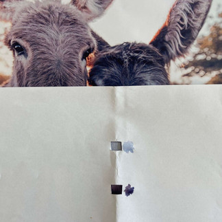
Photo reference: Sam Fisher
Who would have thought that a donkey’s nose was pale blue and purple!
Now these methods may seem a little cumbersome and not quite what you had in mind when all you want to do is to paint expressively or intuitively! But getting to know know your colours is key whatever your painting style. Whichever method you use, take heart in the fact that you are not alone in ascertaining colour and that with enough practice and a good working knowledge of your palette, you will be a able to abandon these aids altogether.


Comments